Waki College Database
A web database for prospective university students in Costa Rica.

Overview
Programa Estado de la Nación is a government research center in Costa Rica. As part of their Education Chapter (Estado de la Educación), they conduct and publish yearly reports on Costa Rica’s main education indicators. They wanted to share their key indicators with a broader audience, so students can make informed decisions on where to pursue higher education studies.
The aim of this project was to create a portal that allowed senior high school students and their caretakers to look for truthful and up to date information on Costa Rica’s public and private institutions for post-secondary education, and their offering.
Client


Role & Duration
Lead UX Designer | Estado de la Educación
Oct 2018 - Mar 2019
My responsibilities included: user research, concept ideation, aligning key stakeholders on product goals, generating information architecture, designing user flows, prototyping, user testing, and incorporating user feedback into design iterations.
Team
Client’s strategy, content, brand, and technology teams.
The Challenge
The way PEN’s databases are structured is far from ideal for sharing with young adults and their families.
The client wanted to share their data as raw as possible, so researchers could benefit from it as well as prospective college students.
The database is composed of hundreds of programs, and not all indicators are available for all institutions or courses.
User Research
A 5-day workshop was conducted with PEN stakeholders, technology partners, and prospective audiences (senior high school students, their parents, high school counselors, and social researchers ).
Research included:
-
Interviewing prospective users.
-
Exploring prospective users' mental models through card sorting exercises.
-
Understating PEN’s available databases.
-
Conceptualizing possible approaches each user would require on the site.

Qualitative Interviews
Understanding our users was a vital part of this project. It was really important to define what each prospective user would find useful on the site and how each piece of information should be presented. In order to achieve that, I gathered as much information as I could from the end-users to understand the challenges they might face and how they see the site making a difference in optimizing pain areas.
Based on the information gathered through interviews with potential users and meetings with stakeholders, I created 3 user personas. I categorized them according to their possible goals and tasks on the site. That is why the counselor and parent user ended up being one persona, since their goals were really similar.

Andrea | Student
Undergrad or postgrad studies
16 to 30 years
"I am trying to decide what to major in"

Clara | Counselor
Teacher or parent
30 to 50 years
"I need resources to guide my students through their vocational process"

James | Researcher
College graduate
25 to 50 years
"I want to get access to reputable databases"


User's top goals
Look for careers or colleges using specific search criteria.
Be able to access the tool using a mobile device.
Get a clear picture of what colleges offer close to my place of residence.
Information on the process of applying for undergrad studies.
Available financial assistance.
Share my search results.
Our results made it clear that students, counselors, and parents shared enough goals and tasks to benefit from the same experience. While researchers were left out from the site’s first release since their needs were so different from the other key audiences.
Getting to know our user's mental models:
I conducted open card sorting sessions with students, parents, and counselors to validate a basic information architecture I had previously worked on with PEN’s strategy and content team.
Based on the research up to this point, we decided to go with a search based structure for the site. My main goal was to allow users flexibility to look up information no matter what their initial starting point was: program, campus, university, etc.

Conceptualization
I created low-fi concepts for primary use cases. After having a go-ahead from the content team, developers, and Stakeholders on low fidelity wireframes, I began to conduct usability tests with these wires. Once updates were made and the team had reviewed them, I began digitizing the design and updating the initial IA.


The Solution
Waki is a web-based app that allows users to get verified information and key indicators from all of Costa Rica’s higher education institutions and most of the programs they currently offer.
A predictive internal search engine was designed and developed to allow users flexibility when looking for career opportunities.

Mobile-first
A mobile-first approach was key to design the PWA (progressive web app) since research allowed me to determine that most of our users will be accessing the tool from their smartphones.

Result views
Depending on what you are looking for, you will get different results organized accordingly. I designed and tested different result views and three of them were implemented in the final version of the experience: map, list, and my favorites.
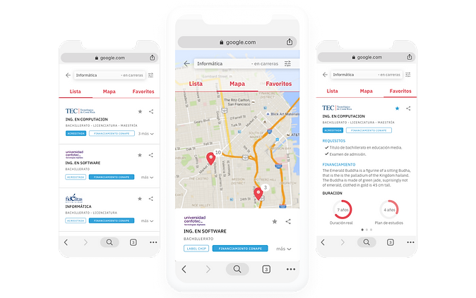
Data visualization
Based on your search results you can get into university, campus, or career profiles. Key indicators for each profile can be visualized in different ways, to allow users to inform their decision-making before choosing where to study.

Additional sections
Postgraduate students and well parents and counselors got their own sections on the site. These are content sections regarding specific topics each audience could find useful.

Usability Testing
I tested the product at various stages of the project.
• Lo-fi prototypes were tested with stakeholders weekly to get feedback on the functionality, content, and interactivity of the product.
• User testing - High fidelity mockups were created for prospective users to use the tool. All participants were using the tool to carry out hypothetical tasks.
Results
Even though I have actively participated with the technology team on the implementation of Waki, the project has not seen the light of day yet, due to budgeting issues that delayed its release.
I produced deliverables and documentation and handed them to the technology team.
There have also been consulting sessions while the implementation is still going.
Lessons learned
1. Test as much as possible
Testing allows you to validate your proposal at different stages of the project (paper, low-fi or hi-fi). Since we tested from the early stages on, we got key insights regarding site structure and content that allowed us to create a better user experience.
2. Don’t be afraid to leave things out
A better experience can be achieved by focusing first on solving your main audience’s needs, instead of solving everyone’s needs. Even though the client wanted to publish their raw databases on the site, once we researched our audiences it was clear this was not the tool for that.
3. The best UX solutions are usually not flashy
The real challenge in this project was defining the logic for the internal search engine and what results to display according to each scenario. This might not require lots of visual design but it smooths out the experience of searching through a huge database.


